 |
| Art and Freedom VIII
The art book Art and Freedom VIII (Libro . Annuario Galeria Artelibre / Arte y Libertad VIII) published by Galeria Artelibre located in Zaragoza, Spain is just in. I'm very fortunate and grateful to have been invited to take part in this edition and was given a 4-page spread. I'm in very select company with over 100 top realists and hyperrealists painters from around the globe, several of which I've admired for many years, while many other talented artists were new to me.
The book cover jacket is graced by a Don Eddy painting. The polyptych, Broken Dreams was on exhibition earlier this year in NYC at the Nancy Hoffman Gallery during the month of January, and I had a chance to admire it up close.
You may order a book from this link - http://www.artelibre-store.com/libros/
|

Thursday, November 21, 2013
New Art Book- Arte y Libertad VIII ( Art and Freedom VIII)


Saturday, October 5, 2013
American Art Collector #96 / The Still Life Invitational

American Art Collector - October 2013
My artwork currently appears in the October 2013 issue of American Art Collector (#96) on pages 124-125 as part of The Still Life Invitational, opening today at the Elliott Fouts Gallery in Sacramento, CA. This exhibition has been held annually during the month of October since 2010, and I've had the privilege to take part in all four editions.

L- Life in Delft, gifts for Griet, 12 x 12", acrylic, 2013 - SOLD l
top R- Mondrian Tumbler, 11 x 14", acrylic, 2013 - SOLD l
bottom R- Peanuts come to Life, an homage to Charles Schulz, 11 x 14, acrylic, 2013 -SOLD l
My three entries as shown in the image above will be included in the group show that runs from October 5-31, 2013.
To inquire about these paintings please contact:
Elliott Fouts Gallery
Elliott Fouts Gallery
1831 P. Street Sacramento, California, USA , 95811
Phone (916) 736-1429
e-mail: efgallery@sbcglobal.net
Phone (916) 736-1429
e-mail: efgallery@sbcglobal.net
Saturday, September 28, 2013
Mondrian Tumbler

Acrylic on gessoed birch panel, 11 x 14"
Painting #217, 2013

Piet Mondrian (1872-1944) was a Dutch-born artist who is mostly recognized as one of the pioneers of Modern Art and is the epitome of the abstract painter. He is one of those artists whose entire body of work could be described as transient. Evolving from representational to non representational forms of art. Initially starting out with Impressionism, Pointillism, Fauvism, Post-Impressionism, Cubism then transitioning to more abstract forms of art. He is a major contributor to the Dutch De Stijl or Neoplasticism art movement. He is most celebrated for his grid-like paintings of vertical and horizontal black lines; using the primary colours, red, yellow and blue and placing them in contrast to the non-colours black, white and grey. He spent much of his professional life abroad in Paris, London and New York City.

As mentioned in the previous post, this past January, my wife and I travelled to New York City for a 4-day winter getaway. During our previous past three visits to the Big Apple, we had always visited the Museum of Modern Art (MOMA). This time around, we only had time for a quick stop at the MOMA Store to browse through their art book selection. Upon entering, I saw these Mondrian Tumblers on a shelf which I simply could not resist. They are made exclusively for the museum. The composition for this painting needed to remain minimalistic and simple. My love of painting with the primary colours and glass made it an easy decision to pay homage to this artist. When ever I see a Monopoly Game board, I think of Mondrian.

Interesting trivia- During the 1920's in Paris, Mondrian became a very accomplished ballroom dancer.
This painting will be included in the upcoming group exhibition, The Still Life at the Elliott Fouts Gallery, October 5-31, 2013.
Elliott Fouts Gallery

photo from our visit to the MOMA in Oct. 2010.
Interesting trivia- During the 1920's in Paris, Mondrian became a very accomplished ballroom dancer.
This painting will be included in the upcoming group exhibition, The Still Life at the Elliott Fouts Gallery, October 5-31, 2013.
Elliott Fouts Gallery
1831 P. Street Sacramento, California, USA , 95811
Phone (916) 736-1429
e-mail: efgallery@sbcglobal.net
-SOLD
Phone (916) 736-1429
e-mail: efgallery@sbcglobal.net
-SOLD
Sunday, September 22, 2013
Life in Delft, gifts for Griet

painting #216, 2013
Girl with a Pearl Earring is one of the world's most famous paintings. It's has often been called the Dutch Mona Lisa, or the Mona Lisa of the North. This Johannes Vermeer's (b. 1632, d. 1675, Delft, Holland) painting has been copied countless times by other artists or incorporated in various fashion in original pieces of art by many others. Little is known about Vermeer's life. Many of the models whom have posed for his paintings have never been specifically identified. With the passing of time, he was forgotten after his death. His artwork only came to light 200 years later. He is regarded as one of the greatest painters of the Dutch Golden age.
Some speculates that the model used in ''Girl with the Pearl Earring'' might have been Magdalena Van Reijven, an art patron's only daughter or Maria, the artist's eldest daughter of which he had 11 children. My approach for this painting was to explore the unknown model behind the painting that was brought to life in Tracy Chevalier's fictional 1999 novel of the same name whom was given the name of Griet. I first came upon the novel in 2003, just prior to the film release based on the source material. The storyline is from the point of view of Griet, a very young woman who goes to work as a servant in the Vermeer household after her own father, a potter and tile maker suffers severe burns from a kiln explosion. The imaginary narrative leads to how she came to pose for Vermeer and the relation she entertained with the artist and his family during her brief stay there.
Chevalier paints life in Holland with a lot of historical details and nuances giving it a sense of authenticity and believability. I read the book with immense interest. When the film was released in theatres it became a magical visual spectacle of what life in Delft during the mid 17th century might have been like. Being able to venture inside a make believe Vermeer studio and how they brought everything to life is a visual feast for any painter. The movie itself was not filmed in Delft but on an existing movie back lot in Luxenbourg. The period film stars Scarlett Johansson and Colin Firth in the lead roles, and was directed by Peter Webber. Johansson was nominated for a Golden Globe and a BAFTA for best actress and did win the BAFTA that year but for another film, Lost in Translation. I loved the fact that they were able to find an actress to play the role of the other servant named Tanneke, who looks exactly like the model in Vermeer’s ''The Milkmaid''. Other details like Vermeer's possible use of a camera obscura to create source imagery for his painting.
Some speculates that the model used in ''Girl with the Pearl Earring'' might have been Magdalena Van Reijven, an art patron's only daughter or Maria, the artist's eldest daughter of which he had 11 children. My approach for this painting was to explore the unknown model behind the painting that was brought to life in Tracy Chevalier's fictional 1999 novel of the same name whom was given the name of Griet. I first came upon the novel in 2003, just prior to the film release based on the source material. The storyline is from the point of view of Griet, a very young woman who goes to work as a servant in the Vermeer household after her own father, a potter and tile maker suffers severe burns from a kiln explosion. The imaginary narrative leads to how she came to pose for Vermeer and the relation she entertained with the artist and his family during her brief stay there.
Chevalier paints life in Holland with a lot of historical details and nuances giving it a sense of authenticity and believability. I read the book with immense interest. When the film was released in theatres it became a magical visual spectacle of what life in Delft during the mid 17th century might have been like. Being able to venture inside a make believe Vermeer studio and how they brought everything to life is a visual feast for any painter. The movie itself was not filmed in Delft but on an existing movie back lot in Luxenbourg. The period film stars Scarlett Johansson and Colin Firth in the lead roles, and was directed by Peter Webber. Johansson was nominated for a Golden Globe and a BAFTA for best actress and did win the BAFTA that year but for another film, Lost in Translation. I loved the fact that they were able to find an actress to play the role of the other servant named Tanneke, who looks exactly like the model in Vermeer’s ''The Milkmaid''. Other details like Vermeer's possible use of a camera obscura to create source imagery for his painting.
Description of pigment used for paint colour. In one scene when art patron Master Van Ruijven confronts Vermeer upon viewing the new commission painting his wife Emily, ''Woman with a Pearl Necklace'', he asks, ''Is this Indian yellow.....distilled from the urine of sacred cows fed only on mango leaves? You glazed my wife in dried piss!". Interesting titbit, on Wikipedia, Van Ruijven's wife name was named Maria de Knuijt.
My painting, it is as much
of an homage to Vermeer, but even more so to Tracy Chevalier. In order to
create a visual narrative that was based on the Griet character during the
final scene in the novel/film, I had the idea of incorporating a new tile to
replace the one given by her father that had been broken by one of Vermeer's
jealous daughter. While browsing on eBay I found this amazing hand painted Blue Delft tile with the
scene of the city itself. It is also known as Delftware or Delft earthenware. The tear drop
pearl earrings I used were also an eBay find from a seller living in China.
In the final scenes of the film, Griet leaves the Vermeers to return
home, crosses a canal on a arch bridge and then soon after, Tanneke arrives at
her house and she is given the pearl earrings as a gift from the artist. In the
book, Griet does receive the earrings as a gift, but the circumstances are
much different. Since the Blue Delft tile features row houses, a canal and
an arch bridge, it really contributes to the narrative for my
composition.

Girl with Pearl Earring, c. 1665
Johannes Vermeer
Mauritshuis, The Hague
In real life, Pieter Van
Ruijven had amassed approximately 20 of Vermeer's paintings during his
lifetime. After his death, and that of his heirs these were sold at auction in 1696
for approximately 70 guilders each. Arnoldus Andries des Tombe, a Dutch army officer later purchased ''Girl with a Pearl Earring'' at an auction in The Hague in 1881, for only two guilders and thirty cents.
At the time, it was in poor condition. Des Tombe had no heirs and donated this
and other paintings to the Mauritshuis in 1902. In the movie, the painting
being acquired by Van Ruijven is ''Woman
with a Pearl Necklace'' with his wife Emily modelling the same type of pearl
earrings as in ''Girl with a
Pearl Earring''. The two models also
share the same facial features upon close examination. Personally I think that
the model in both of these paintings is the same person. The turban she wears
only adds an element to distract the viewer. Furthermore, these two
paintings are dated one year apart. Then again, the same pearl earring appear
in several other paintings on different models as does the ermine-trimmed
yellow jacket shown below.

Woman with Pearl Necklace, c.1664
Johannes Vermeer
Gemäldegalerie, Berlin
I am a great admirer of Vermeer's artwork. Only 34 paintings have been attributed to him (view them HERE). During my travels, I've had the privilege to see 22 of them. These are housed at the Rejksmuseum in Amsterdam, the National Gallery in London, the Louvre in Paris, the National Gallery in Washington, DC, the Isabella Gardner Museum in Boston, the Frick Collection and the Metropolitan Museum of Art both in New York City. My personal favourite is ''Milkmaid''.
And yes, I did use Indian Yellow in bringing Griet to life.
______________________________
Update:
Not all Friday the 13th are unlucky. This past May 13 2016, I've had the immense pleasure of visiting the Mauritshuis in The Hague. The following day, my wife Suzanne and I strolled the canal streets in Delft. My longing to visit the land of Vermeer finally came to be during a 2-week backpacking trip of Belgium, The Netherlands and Norway.

The Mauritshuis (Art Museum), The Hague

Girl with a Pearl Earring - Johannes Vermeer
The Mauritshuis

The Mauritshuis

Location as featured on the Delft Blue tile in my painting, Delft Holland

Delft, Holland
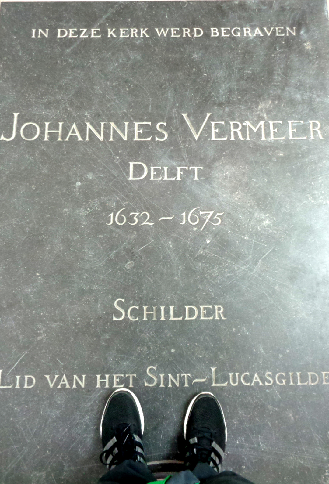
One of two tombstones of Johannes Vermeer inside
the Oude Kerk (Old Church), Delft.

Painting on loan from the Rijksmuseum, Amsterdam
Elliott Fouts Gallery
1831 P. Street Sacramento, California, USA , 95811
Phone (916) 736-1429
e-mail: efgallery@sbcglobal.net
-SOLD
Sunday, August 25, 2013
Post-Modern Times

Back in June, I was contacted by Stephen Smith, the founding publisher of rather new art publication called Post-Modern Times. The magazine really caters to aspects of realism and aesthetics in art. I am very fortunate to have been invited to participate in volume 2, and was granted a six-page layout to showcase my artwork. I am in very select company, because several artists whom I have admired greatly in the past are either in this issue or the inaugural volume.

A digital and/or in print copy is available through this link by clicking HERE. It is published by the Birmingham Free Press.
Saturday, July 27, 2013
Peanuts come to Life, an homage to Charles Schulz

Acrylic on gessobord, 11 x 14"
painting #215, 2013
Ever wondered how and why the comic strip received the name Peanuts? The origins goes back to the theatre, where the cheapest seats were those way at the bottom floor and where people purchased peanuts because they were the cheapest snack. If they disapproved of the performance, they would throw peanuts at the actors. If they would shout insults, the announcer would reply, "No more comments from the Peanut Gallery". The term Peanut Gallery was later adopted for the children audience featured in the Howdy Doody TV Show that originated in the late 1940's.
In 1950, Charles Schulz approached the United Feature Syndicate with his best work from a comic strip named Li'l Folks. But since the name Li'l Folks was too close to the names of two other comics of the time: Li'l Abner and Little Folks, and in order avoid confusion, the syndicate settled on the name Peanuts, after the Peanut Gallery featured on the Howdy Doody show. Peanuts was a title Schulz always disliked. In a 1987 interview, Schulz said of the title Peanuts: "It's totally ridiculous, has no meaning, is simply confusing, and has no dignity—and I think my humour has dignity."
Last year my wife bought a jar of Planters roasted peanuts which immediately ignited the whole concept. A few weeks later while strolling in a local antique shop, I found an issue of LIFE magazine dated March 17, 1967, featuring the protagonist and his dog with the headline reading: "The great Peanuts craze - CHARLIE BROWN and SNOOPY WINNERS AT LAST". This would become the perfect vehicle and element of contingency for my composition.


The 1967 LIFE article reflected that despite the fact the 'Peanuts' characters who were born to be losers, in contrast, the popularity of the comic strip had attained new heights and had started a craze around the world.
"At scores of colleges, Peanuts characters are the biggest people on campus. In Vietnam, pilots fly into combat with Snoopy painted on their planes. Records based on Peanuts have sold millions of copies ("Snoopy and the Red Baron", "Return of the Red Baron" by the Royal Guardsmen). And even before it opened last week, a new off-Broadway hit musical,You're a Good Man, Charlie Brown, had sold tickets to admirers as far away as Nebraska. Dolls, cards, clothes and other Peanuts paraphernalia make up a more than $15 million-a-year business. Charles Schulz describes himself as "100% Charlie Brown." But unlike Charlie, who has lost a 123-0 baseball game, Schulz as a youngster pitched a no-hit, no-run game- and is today several times a millionaire".
- LIFE Magazine - March 17, 1967.
In 1967, the comic strip had a following of 90 million readers a day. Before the passing of Charles Schulz in 2000, it had reached a milestone of 355 million readers in 75 counties.
Needless to say, the popularity of the Peanuts lives on in comic strips reruns. Snoopy is featured on the front of the Metlife blimp. Most recently, a song entitled Charlie Brown was featured on the 2011 Coldplay album, Mylo Xyloto. The musical, You're a Good Man, Charlie Brown has been a popular choice for amateur theatre productions because of its small cast and simple staging. It won several theatre awards during it's original 1967 run. During the 1999 Broadway revival, it would receive a Tony nomination for Best revival of a musical and won Tony awards for Kristin Chenoweth as Sally and Roger Bart as Snoopy in the best featured actress/actor categories. It is currently playing until the end of the month at the Woodland Opera House, in Woodland CA, near Sacramento. I am quite certain that the audience won't be throwing peanuts at the actors on stage this time around.
This painting will be included in the upcoming group exhibition, The Still Life at the Elliott Fouts Gallery, October 5-31, 2013.
This painting will be included in the upcoming group exhibition, The Still Life at the Elliott Fouts Gallery, October 5-31, 2013.
-SOLD
Friday, July 19, 2013
Passing of a Great Artist

Sackville, NB
It is with a sad heart that I learn Wednesday of the passing of one of Canada's greatest artist. Alex Colville, 92 died peaceful at his home in Wolfville, NS. Today, I read a CBC on-line interview where his daughter Ann mentioned that "If he would get letters from young artists, aspiring artists, he was tremendously kind and took a lot of time to respond to these". That statement rings very true for me as I have five reply letters with great advise to work hard in order to find my way as an artist.
During my formative years as an aspiring artist, the surrounding milieu of Mount Allison University in Sackville, N.B. kind of became a pilgrimage place for me. It was where he received his Fine Art degree and later thought art for almost 20 years. It gave me great insight into his artwork that was so regional and yet he had attain great national and international recognition. That a local artist was revered as Canada's painter laureate was certainly a great source of inspiration for myself and countless other realist artists, as the images he created are forever etched in the consciousness of our nation. I had the privileged to view several of his retrospective exhibitions including Alex Colville: Paintings, Prints and Process, 1983-1994 at the Museum of Fine Arts in Montreal (1994), Milestones at the National Gallery in Ottawa (2000), the Dow Gift in Wolfville (1997) and Return at the Art Gallery of Nova Scotia among others.

I had the enormous pleasure of meeting him during the opening reception of his gift of preparatory drawings to the Owens Art Gallery during the spring of 2002. When I introduced myself, he quickly asked me, "Are you the runner?". I was so touched that he instantly recalled me writing to him. We had a very pleasant and animated conversation. To me that spoke volume of the man and artist he was. Confident in his role as a respected and celebrated artist and even better as a great human being. He remained active well into his late eighties. He will be missed. His essence and artwork will live in my heart forever. Condolences to the family and all of those who's lives he has touch.
Sunday, April 7, 2013
Kool-Aid Days

Acrylic on gessobord, 12 x 16"
2013, painting #214
This is a gallery commission piece. The client is a collector of both Crown and Ball Mason jars, so this was the main requirement. I was pretty given much given carte blanche as far as the composition goes. As a still-life painter, objects often present themselves in daily life. If I have a visceral response to them, I will just buy them on impulse because one day these will serve as my muses to inspire an imagery worth considering. I have been holding on to these Kool-Aid packs since 2007. The teal tinted Ball Mason jar on the left and the hand- made paper drinking straws were both purchased on Etsy in 2011 from different vendors from Florida, the sunshine state. Last fall, I was lucky enough to acquire these Crown Mason jars from a local seller on Kijiji. These are in mint condition, so I was truly surprise to see the year 1948 on the bottom.
Kool-Aid was invented by Edwin Perkins. All of his experiments took place in his mother's kitchen. Its predecessor was a liquid concentrate called Fruit Smack.To reduce shipping costs, in 1927, Perkins discovered a way to remove the liquid from Fruit Smack, leaving only a powder. Perkins moved his production to Chicago in 1931 and Kool-Aid was sold to General Foods in 1953. Hasting, Nebraska, the town where the fruity thirst quencher was invented still celebrates a yearly summer festival called "Kool-Aid Days" on the second weekend in August. The title is in homage of it's inventor.
I remember as a child that we use to buy individual packages like these at 6¢ each from a nearby corner store. On hot summer days, we'd go swimming at the beach and upon returning a pitcher was soon empty with three kids going for refills. Check out this classic 1970's commercial - HERE.
-Gallery commission
Wednesday, March 27, 2013
Our past, present and future according to Suess

Acrylic on gessobord, 12 x 12"
Painting# 213, 2012-13
This is my third painting paying homage to Dr. Suess. The first two featured our pet goldfish Maurice who is still alive and well and will mark his 3rd anniversary with us next week. I was contacted by one of the galleries that represent me in early fall of 2012, after a patron happen to see "One fish, two fish....gold fish" on their website. Since it had already sold to another collector, I agreed to do a commission piece for them. During the past decade, this patron had acquired several of my paintings, so I submitted several images for their approval which included this more personalized composition. Putting my own spin on the image, I continued along the lines of the postage stamp series and fabricated a First-Day cover. I used a fish in the Suessville postmark to indirectly add Maurice in the mix. The postage stamp I used was issued by the US Postal Service in 2004, marking the 100th anniversary of the birth of Theodore Suess Geisel, (b. March 2, 1904). I decided to omit USA in order to create a more fictional territory for the narrative. The remaining of the objects were suggested by the clients for possible inclusion.

Molly Templeton (aka- Mememolly) of Rocketboom News
-Gallery commission
Monday, November 26, 2012
Marathon, a self portrait

2012, painting #212
The Elliott Fouts Gallery in Sacramento, CA invited me last summer to
take part in an invitational group show entitled ''Face Yourself''
that will feature artist self portraits. The invite stated, ''This can be
conceived from your own point of view, how you think people view you, etc...You
can get as creative as you want, there are no rules. I think the possibilities
are endless and the outcome of the show is going to be fabulously unexpected
and fun''.
I
really went outside the box for this one, and literally inside a jar. Although
I have been painting for 25 years, my artistic professional career only
began 10 years ago. Prior to 2002, I completed an average of only two paintings
per year. For a full decade, my main focus during my spare time was pursuing my dream of being a
marathon runner.
I
started running in 1976 at age 14 while in junior High School. The Summer
Olympics held in Montreal that same year would leave an indelible mark on me.
When Canadian Olympian Jerome Drayton won the Boston Marathon the following
spring in 1977, his victory would ignite the flame within me to become a long
distance runner and to one day follow in his footsteps.


The
journey getting there was long and arduous. After competing in athletics and
cross country races in junior and high school, I made the transition to road
races. During my twenties, I had my share of running related
injuries and was diagnosed at age 26 with heel strike hemolysis. A rather rare condition causing damage to red blood cells occurring during intensive training and repetitive foot strike when running resulting in anaemia. This was corrected with iron supplement and kept
in-check afterwards while continuing the therapy.
In September 1992, at age 30, the stars finally aligned for me and I would run my first full marathon. I had waited so long for this day, and thought it might be my one and only, so I decided to go big and run the Toronto Marathon, the city where my hero Jerome Drayton lived. I was so overwhelmed by it all and remember being teary eyed several times during the race. Half way in, I was still on pace to qualify for the Boston Marathon. With about 5 miles to go, I would hit the wall. I would however get a second wind on the final mile and had enough left in the tank to sprint the last 200m as we were greeted inside Varsity Stadium where a massive jumbo screen was set up and spectators in the bleachers cheers us in. I finished in a time of 3h22:10. It was a defining moment in my life and from that point on, I was hooked.
My
next goal was to achieve the qualifying standard for the Boston Marathon
which was 3h10:59 for a male runner under 35. This would finally happen seven marathons and three years later on May 14, 1995 at the Johnny Miles Marathon
in New Glascow, Nova Scotia. On this very difficult course, I would achieve a personal best of
3h11:30. I would find out later that year that my clocking would stand and I received my ticket to the start line of the historical 100th running of
the Boston Marathon that was held on April 15, 1996. Running my first Boston Marathon easily qualifies as the greatest
moment of my whole athletic journey. The history behind this event is rich and
is considered by many as the people's Olympics. It has always been held on the third
Monday of April on Patriots Day. The inaugural running of the Boston
Marathon took place in 1897. It was inspired by the marathon of
the first Olympiads of modern era held in Athens, Greece the previous year.
In total, I completed 22 marathons and every one hold a special place in my heart. From the get-go, I decided to combine the races with travelling, and visiting art galleries and museums whenever possible. For the exception of three Boston Marathons (1996, 1999 and 2000) and two New York City Marathons (1994, 2002), all the others were in different towns and cities, twelve in the United States, nine in Canada plus the Bermuda Marathon.
In the composition for this painting, the photograph of myself was taken during the last mile of the 1999 Boston Marathon.
In total, I completed 22 marathons and every one hold a special place in my heart. From the get-go, I decided to combine the races with travelling, and visiting art galleries and museums whenever possible. For the exception of three Boston Marathons (1996, 1999 and 2000) and two New York City Marathons (1994, 2002), all the others were in different towns and cities, twelve in the United States, nine in Canada plus the Bermuda Marathon.
In the composition for this painting, the photograph of myself was taken during the last mile of the 1999 Boston Marathon.

The
seven bid numbers used in the composition are among the marathons which hold the
most importance on various levels. From the top
left -clockwise:
1- New York City Marathon - 2002


Bill Rodgers is a 4-time New York City and
4-time Boston Marathon Champion.
One of the greatest ambassador the sport has ever known.
One of the greatest ambassador the sport has ever known.
2- Maine Marathon - 1998
3- The 100th running of the Boston Marathon - 1996.
3- The 100th running of the Boston Marathon - 1996.
4- The Toronto Marathon - 1992
5- The Fredericton Marathon - 2001
6- The Johnny Miles Marathon - New Glascow, NS.- 1995
5- The Fredericton Marathon - 2001
6- The Johnny Miles Marathon - New Glascow, NS.- 1995
7- The Chicago Marathon - 1993
UPDATE- January 5, 2013
This painting is currently on exhibit in ''Face Yourself'', an Invitational group show being held from January 3-31, 2013 at the Elliott Fouts Gallery in Sacramento, California.
Participating artists includes the talents of Lisa Alonzo, Teresa N. Fischer, Jeff Nebeker, Rogelio Manzo, Elizabeth Barlow, Jennifer Balkan, Ryoko Tajiri, Kenney Mencher, Micah Crandall-Bear, Bryan Mark Taylor, John Tarahteeff, Jelaine Faunce, Randy Brennan, Gale Hart, Terry Pappas, Maren Conrad, Gary Pruner, Patricia Wall and John Karl Claes.
Collection of the artist.
Friday, October 5, 2012
THE STILL LIFE INVITATIONAL / AMERICAN ART COLLECTOR - OCT. 2012


My two submitted pieces are-
Tangerines in a Hurricane Vase, an homage to Edgar Degas
15 x 11, acrylic on hardboard 2009/2012
l
l
___________
Famous for more than Fifteen Minutes
16 x 11' acrylic in hardboard, 2012
l
1831 P. Street Sacramento, California, USA , 95811
Sunday, September 9, 2012
Car Jam

Acrylic on gessoed hardboard, 16 x 12''
painting # 211, 2012
This painting has been on the back burner for more than three years. I had purchased these Hot Wheels and Matchbox cars at the time and already had a concept in mind, but there was one illusive item to complete the composition and play with words that I have yet to find to satisfy me visually. In the past year, I came across this magnificent mason jar and book which in turn created a different narrative from my original concept.
The featured book, THE CAR, A HISTORY OF THE AUTOMOBILE was written by British-born Jonathan Glancey, whom until this past February was an architecture and design editor for The Guardian. He previously held the same position at The Independent and is currently a freelance editor. He has recently written several reviews for The Telegraph, including one about the recent opening to The ArcelorMitta Orbit at London's Olympic Park by artist Anish Kapoor and structural designer Cecil Balmond. He has also written several books surveying the history of architecture, planes, trains and automobiles. This edition was published in 2010 by Seven Oaks. The cover features a 1945 ZIS 110 Limousine, while the bottom is a Ferrari Enzo. I slightly played with the depth of field and keep the back imagery just slightly out of focus thus eliminating the very fine details so that the main details would focus on the jar and it's content.
The jar includes the following models from Matchbox- a 1957 GMC Pick-up truck, a 2008 Chevy Corvette ZR1, and a 2005 Dodge Magnum. To complete the quintet, two Hot Wheels muscle cars: a 1970 Chevelle SS and a 1971 Dodge Charger.
This painting is very much as the bold letter on the mason jar suggests, about the preservation and restoration of automobiles. There is great interest in vintage and classic cars. Here in Moncton, the city hosts the Atlantic Nationals, a car show held over 3 days in July where the public comes out in droves. It's an eye-candy love fest for car lovers of all ages. I recently spoke to the wife of the chap to whom I had sold my first car, a 1971 Chevy Malibu. I sold it for $200, the same price I paid for it back in 1981. My father had helped me acquire the vehicle for a summer job when I was 19 years old and only kept if for 6 month. It was on its last miles when I sold it.....until he completely restored and transformed it into a veritable muscle car. She told me that it had been parked in their backyard in recent years, but it was still his baby and that he fully intended to refurbish it before long.
This painting was exhibited in:
ASPECTS OF REALISM
Saint John Arts Centre
City of Saint John Gallery
20 Hazen Avenue
Saint John, NB CANADA
(506) 633-4870
September 7 - October 27, 2012
-SOLD
ASPECTS OF REALISM
Saint John Arts Centre
City of Saint John Gallery
20 Hazen Avenue
Saint John, NB CANADA
(506) 633-4870
September 7 - October 27, 2012
-SOLD
Subscribe to:
Posts (Atom)